
Why Colour is so Important for Chocolate Packaging
Yep, you read it right; the colour of packaging accounts for 85% of the reason why consumers choose to purchase a product.
In this article, we’re going to talk about why your chocolate packaging needs the right colours, how colours affect consumer behaviour and how harnessing colour will benefit your business!
Why is packaging important?
“Steve [Jobs] and I spent a lot of time on the packaging…
You design a ritual of unpacking to make a product feel special.
Packaging can be like theatre, it can create a story.”
Jony Ive, Apple’s former Chief Design Officer
And, as a person in the business of sweet treats, you’ll know all too well that presentation is critical.
Although, you don’t need to run a business to know that.
Take Instagram, for instance. In this digital age, our society is addicted to scrolling through artful, almost hyperreal depictions of everything from fashion to food for hours a day.
And now, Instagram has also become a platform on which businesses can thrive off the fact that we as human beings love looking at pretty stuff - we also love buying it.
But thoughtful presentation shouldn’t stop at your product. The real world still exists, after all!
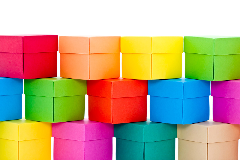
Packaging really is just as important as the quality of the product inside it. Why? Because it is a vital element of the multisensory experience your consumers want.
After all, it’s the experience that’s going to keep them coming back.
Why are colours important for packaging?
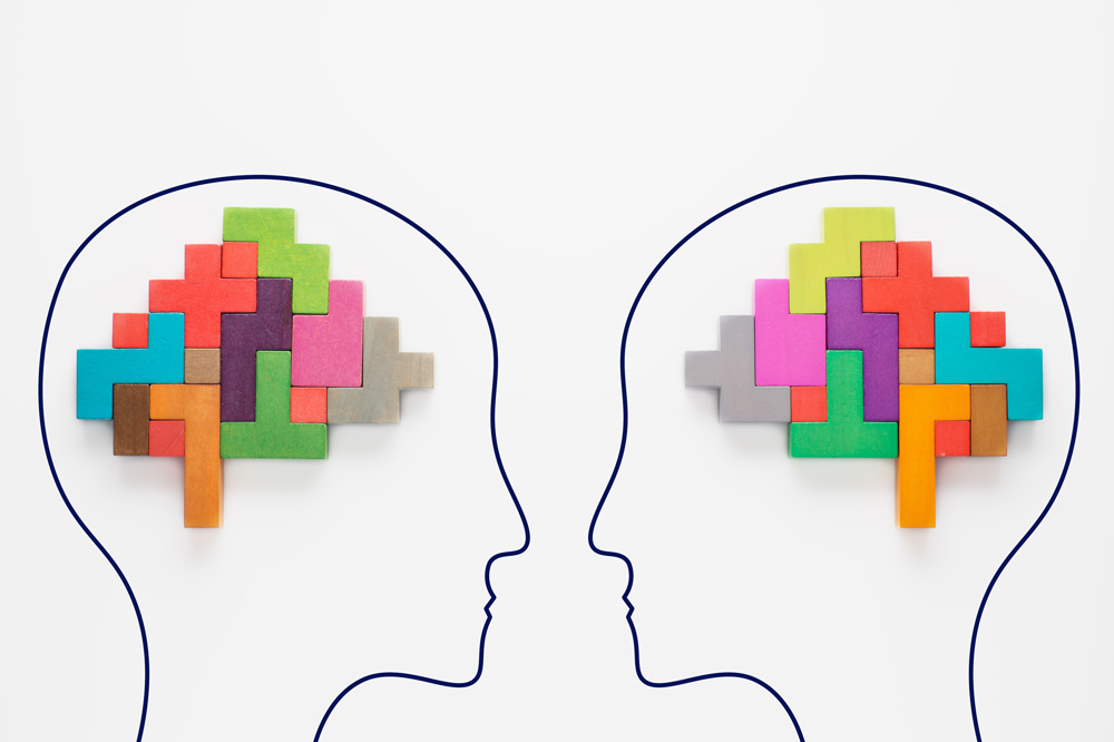
The influence of colour on human perception should not be underestimated.
In our more primitive days, colour would feed us messages about the world around us, like “keep well clear of that brightly coloured spider” or “this fruit promises sweet, juicy hydration.”
Now, the same applies, just with a new focus. Humans have and always will, consciously or subconsciously, associate colours with meaning.
Marketeers and designers use colour and design to convey a theme, a feeling, and a message that aligns with the brand, the product and the consumer’s desires.
And it’s a tool that’s proven successful.
If a consumer is buying a premium confectionery product, they want the full package to be aesthetically pleasing to the eyes, hands, and palate, like a peach. And businesses want all of that too, but they also want their packaging to sell itself, without saying anything at all.
It’s called visual language, and, when understood and used correctly, it can be a very powerful thing.
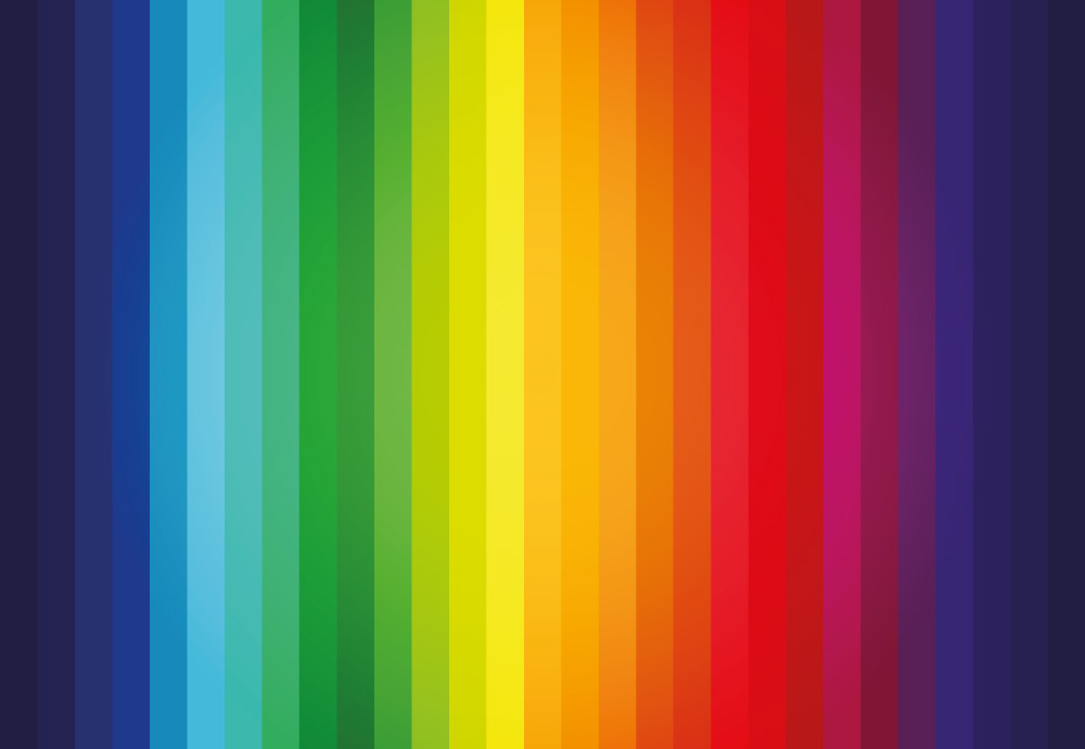
The powers of colour psychology
Colour psychology, or the psychology of colour, is the study of different hues as a determinant of human behaviour and perception.
Numerous studies show that hues, and their subsequent shades and saturation levels, can even influence perceptions that aren’t so obvious, such as the taste of food.
It’s the reason why Starbucks is predominantly green and earthy, Coca-Cola and fast food logos are predominantly bright red, and most toothpaste brands are commonly blue and white.
In a 2008 study, 75% of the participants used the following words to describe the following colours:
- Red = anger, urgency, energy, passion
- Orange and Yellow = happy, cheerful, energising
- Green and Blue = peaceful, relaxing, clean, calming
- (88% of participants) White = innocent, clean, happy, euphoric
- Brown, Grey, Purple = less agreement and some confusion on their meaning
The effects of colour differ between people, depending on factors like age, gender and culture. In the same study, 69% of participants associated the colour Black with darkness, evil and death (yikes).
Whereas, today, and at least in Western advertising, Black is used to denote luxury, mystery, sensuality, and sleekness.
So, it’s important to consider those factors when thinking about your own desired audience.
What the study does show is that the brighter hues evoked positive, pleasurable emotions. And that’s exactly what you want when you’re trying to sell chocolate and confectionery products.
The finest colours for your chocolate packaging
These are our suggestions for bringing colour psychology to your packaging!
Zesty Orange
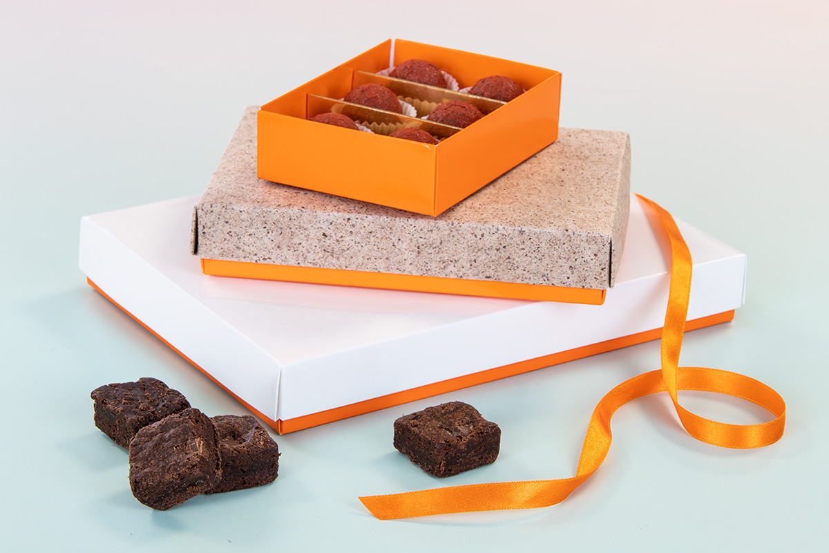
Happy, vibrant, cheerful and energising.
Bright, citrus orange is the perfect hue to entice your consumers towards a box of flavour pairings that are, at once, sweet, tropical, bold and fruity.
Tangy Green
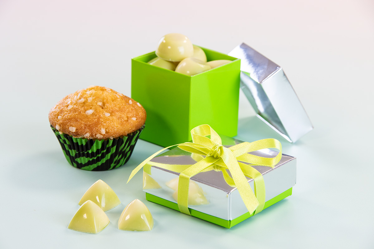
Refreshing, uplifting, positive and freeing.
Opting for a vibrant green can really compliment clean, refreshing flavours like citrus and mint, or you could use it to hold fun cocktail chocolates, like Mojito Chocolates.
Hot Pink
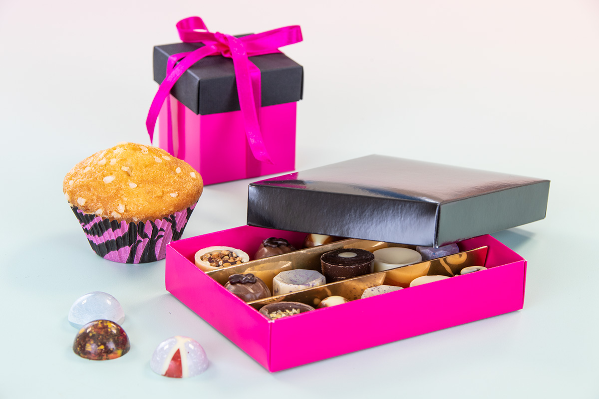
Energetic, passionate, fun, loud and daring.
A colour made for your most eclectic, surprising, unfamiliar flavour pairings, hot pink will take your customers' senses on an exotic adventure.
Linen White and Buttery Beige
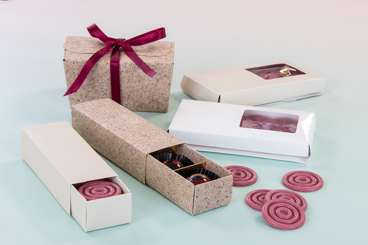
Relaxing, cool, clean and natural.
For your soft, balanced, herbaceous and subtle flavour combinations, opt for nostalgic linen white or butter beige.
Whatever your brand, wherever you are, colour is there to be experimented with and enjoyed! As a brand, you’re free to play with any colours you like when you have distinctive personalisation on your side.
So, have fun with it, and let your chocolate packaging speak for you.